This is a guest post that was originally published by Andrea Saez on ProdPad.
Up until recently, no one really knew what product roadmaps were supposed to look like, but we all knew something had to change.
At my old companies, we were using JIRA and a release planner to communicate our product plans. They were long, complicated, and detailed – because you know, they’re made for devs – and made for messy backlogs that were extremely hard to follow.
Today, roadmapping is a contentious subject but at least one thing is self-evident: We know that no one really reads overly detailed roadmaps (TL;DR!)
We’re also discovering how powerful it is when when a roadmap is so clearly designed that teams put it at the center of product decisions, and companies put it at the center of their business decisions.
We’re seeing how a roadmap can bridge your work with everyone else’s and put you back in control of your product. But what does that roadmap look like?
In this post, I’ll show you how we use our product roadmap to communicate high-level priorities so clearly that anyone – from CEO to summer intern – could walk away knowing what’s going on.
What does a good product roadmap look like?
The litmus test for a good product roadmap is that it’s visual, accessible and clearenough for anyone to scan for answers to the following questions:
- What are we doing?
- Why are we doing it?
- How does this tie back to our OKRs?
This is the fundamental idea behind a theme-based product roadmap – and its benefits are enormous and immediate.
- Have way fewer meetings – Your priorities (what and why) are clearly documented on the roadmap. You don’t have to explain things differently to different people.
- Foster healthy team debates – Your roadmap can be the reference point team members use to challenge themselves and one another to link their deliverables back to roadmap goals and OKRs.
- Make product decisions everyone understands – You’re no longer the bad guy batting down ideas. You can actually discuss customer feedback and ideas through the lens of your roadmap and priorities everyone can see.
In the words of Teresa Torres: “We need to let go of the idea that we can enumerate a list of features that represents what we’ll do in the future. This idea is absurd. Rather than sharing feature lists with the rest of the company, we should be communicating how we will make decisions.”
A theme-based roadmap is designed to be flexible, so your plans can change as circumstances change, and act like the communication tool it is meant to be.
First, draw three columns
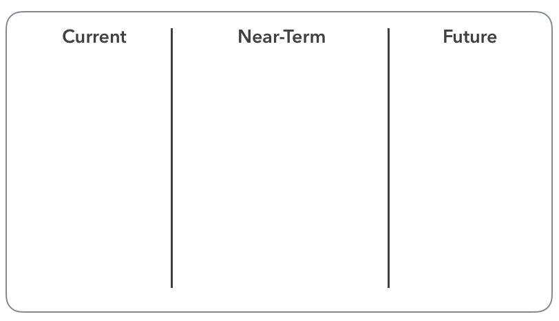
You might be familiar with a roadmap that contains includes release dates. A theme-based map replaces that with time horizons, made up of three columns:

- Current: Stuff that you are currently working on.
- Near-Term: Stuff that’s coming up soon.
- Future: Stuff that you’d like to work on in the future, but need to do a bit more research before you move on.
Note that we aren’t showing any dates. This is not a release planner, it is a bird’s eye view of your priorities. Those are always subject to change – especially out in the future which you can’t meaningfully plan for today.
The point is to leave room to adjust to change. If something was current, but now you want to push it back, you can.
You don’t have stick to our terms either! The team at Foursquare divides their roadmap using #now, #next, and #later.
Lay out broad themes
You might be familiar with a roadmap that includes a list of features and their expected completion date.
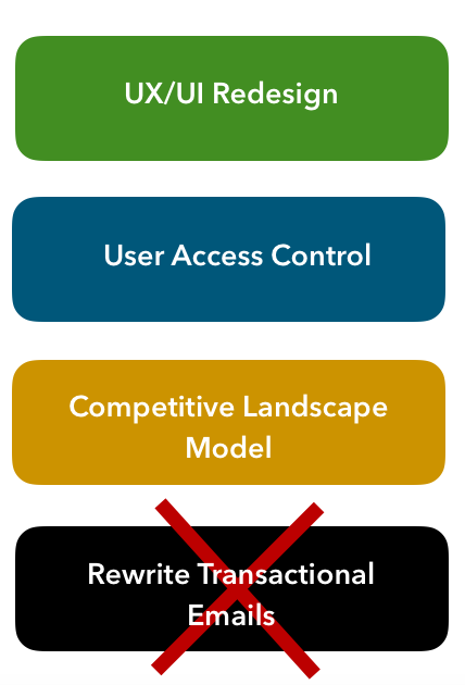
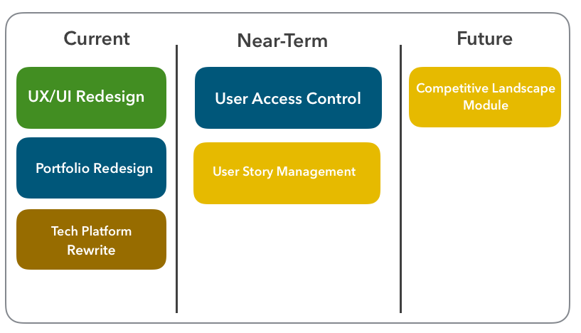
A theme-based map replaces that with (you guessed it!) themes, which sit on your roadmap as cards.
Themes are “a promise to solve problems, not build features,” says founder of User Interface Engineering Jared Spool.
Those words stem from the realization that for almost any product, you’ll have a flood of feedback and feature requests from customers that actually revolve around a single universal problem.
You could be a slave to those requests or step back and tackle the root with a single, elegant solution.
Working in themes gives you the space to explore how you might want to approach each problem, and decide how to get it done later.

Why does that last one get crossed out? Because your cards should be strategic. “Rewriting transactional emails” is too specific to be a strategy. It’s an idea, and it’s a tactic, and they don’t belong in the high-level view you’re building out in this step.
However, it would belong as an idea within a roadmap card with a higher scope.
Add supporting details
Once you have your themes down, you can attach more supporting details for anyone who wants to drill further down. These details help us strengthen what we’re putting on our roadmap, which again, could include useful information for those reading it:
- What are we doing?
- Why are we doing it?
- How does this tie back to our OKRs?
Internally, your team will have access to detailed information which will help prepare them and guide them through your workflow. These details include:
- Ideas – Tactical suggestions for improvement. These ideas answer a simple business case: What problem are you trying to solve?
- Customer feedback – We attach feedback directly to ideas in ProdPad, so they can be linked to potential improvements and we can easily track what our clients are asking for.
- User stories – Use case scenarios for ideas: As a user, I want to X in order to Y.
Cards sitting on the Future column don’t have to have all those answers yet, but as a card moves closer to Current term, they should become a lot more detailed.
Tag and organize
As you build your roadmap, you can color code and tag them to allow the viewer to sort through and filter down based on a particular interest. Kind of like you do with post-it notes!

How about that basic usability, huh? This keeps it visually easy and engaging, and everyone will be happy you didn’t make them sort through herds of cards to find what they came for.
Instead of staring blankly at one big roadmap, your colleagues can focus on the ones that are relevant to them.
The Takeaway: This Roadmap Is Bigger Than You
I couldn’t express the value of a theme-based roadmap any better than Jared Spool already does: “The sheer brilliance of [this] idea is how, with a single gesture, learning everything about the customers becomes the most important focus of creating the product strategy. When companies talk about features, they are saying, “Look at us. Look at what we can do.” When companies talk about the problems of the customers, they are saying, “Look at what you’re dealing with. Look at how we want to help.”
And what you’re really what you’re doing in a single stroke is empowering everyone at your company to think this way. Not just you. Can you imagine how powerful that is?
About the author: This was a guest post contributed by Andrea Saez, Head of Customer Success at ProdPad and Community Moderator at Product Manager HQ. This article was originally posted on ProdPad.
Interested in learning other fundamentals of product management including how to build a product roadmap for your own project? You might want to check out our One Week PM course.
Join 30,000+ Product People and Get a Free Copy of The PM Handbook and our Weekly Product Reads Newsletter
Subscribe to get:
- A free copy of the PM Handbook (60-page handbook featuring in-depth interviews with product managers at Google, Facebook, Twitter, and more)
- Weekly Product Reads (curated newsletter of weekly top product reads)

